Information Architecture
and Navigation Design
Web designers can not control the path a user chooses to travel on the
web but they can make their content enticing and accessible by creating
a logical and meaningful structure for the site's content. We refer to
this structure as the site's information architecture
and this needs to be combined with good crafting tools to make navigation
and getting
to the information within the structure easier. We refer to this navigation
as the site's interface design.
Information architecture and interface design are very critical components in web design. The system must fit the user, not the other way around. How one easily navigates through a site determines for the most part whether the experience will be a positive one or a frustrating one for the user. The site's information structure must be well thought of and layed out with the user (target audience) in mind. Does it pass the 3-click test?
When planning the site's sections, think in terms of content "categories" instead of being content "specific" to allow for flexibility and easy replacement of new copy or material. When designing the interface elements, think of the navigation bar as part of the site's identity, not purely as a means to getting to the information.
(Note: The Elements of Web Design book by Darcy Dinucci, is a good resource for learning more about information architecture and interface design.)
There are many approaches to developing and designing a web site. But it's always helpful to follow a more focused design process. Below are steps and approaches to the development and production of a web site as you begin the process of designing it:
- Concept. The first stage of a web page project is developing
a concept, just like in print media. But to effectively formulate the
concept, you need to do some research. The beginning of any design
project always involves the research phase. In this phase, the designers'
immerse themselves in the project requirements, and the client's needs,
which must be fully understood and communicated. Here are what you
need to do in the "concept" phase:
- Define the client goals and requirements
- Define the audience and target market
- Shape the design solution
- Define the scope and content of the web site
- Compare and contrast existing web sites with similar characteristics
- Determine the constraints of time, money, and talent
- Architecture Information and Interface Design. Before visual
design can begin, it's important to understand how the content of the
site is going to be organized, how deep or shallow
the site architecture is going to be, and the interface strategy to
navigate the site. Below are what you need to do to accomplish this:
- Define the attitude of the web site and the organization/brand it represents
- Establish a unified style and personality that reflect the essence of the company
- Choose a technology to deliver the content that makes sense for the project
- Define the most clear organization of content, featuring the most important categories and achieving the requirements defined in the research phase. Keep in mind the 7+-2 rule .
- Create a site map and "map out" the navigation and hierarchy of information
- Storyboard the dynamics
- Create sub-categories if necessary, but keep the levels of hierarchy to a minimum
- Create a prototype of the site, if there are resources to do
this
- Production. After the interface design and the architecture
of the site are establish, the actual building of the site begins.
Before you start the visual design, gather and create design elements (called "assets" in
Dreamweaver). Collect various elements so you have a broad set
of materials to work with and gain inspiration from. The idea is to
have more than enough material to experiment and sketch with.
- Collect magazines, web sites, and other materials that have great design ideas. They should be both related and unrelated to the field of the web site. Use these good design concepts for inspiration.
- Get photographs/drawings/etc. of products or concepts used on the site
- Develop several themes, concepts and rules that will inspire and constrain your design choice.
- Gather or create logos, shapes, forms, and other graphic elements that can be used in the design
- Develop several possible color palettes
Sketch designs. Experiment with elements you've gathered and create several different sketches of the home page.- Try pencil and paper as well as Photoshop/Illustrator. Don't use Dreamweaver.
- Develop a major theme or concept for the home page, considering your research and information design -- audience, attitude, site goals, navigation, and categories
- Consider how the home page will relate to the sub-pages
- Tie all the elements together on the page
- Don't incorporate every element and idea -- be willing to throw out good ideas that don't fit
- Remember the basic principles of design, including proximity, alignment, flow, repetition, and contrast
- Cut, refine, simplify, and clarify your designs
- Select the design that best communicates the attitude and goals defined in the research phase
- Refine the page composition and color palette as you create the new version
- Consider download time
- Sketch several subpage designs using important design elements from the home page
- Modify the elements to fit the subpage -- reduce, change color, rotate, stretch, etc.
- Make the navigation clear, functional and out of the way of the content. Consider making it smaller.
- In most cases, content should dominate subpages more than on the home page.
- Select the best designs and execute them in Photoshop or Illustrator.
4. Testing, Refining, Retesting. It is always better to discover problems with your web site BEFORE you post your site for all the world to see. Testing and retesting allow you to troubleshoot your files before they go "live." This is a critical step in the design and production process and can not be skipped.
5. Marketing your web site. When your web site project is completed, you need to get the word out that you have a new website. Some ideas: register your site with the Search Engines, have business cards made with your URL, trade links with other web sites, advertise in print publications, seek award competitions.
If you want to learn more about the design and production processes in website development, check out the Web Design Wow Book by Jack Davis and Susan Merritt, 1998
Some useful and interesting sites to browse at your leisure:
- Search Engines www.searchengines.com
- Communication Arts www.commarts.com
- Design Media www.lynda.com
- Getty Center www.getty.edu
- Apple Website www.apple.com
- NY Visual Arts www.sva.edu
- NAPP www.photoshopuser.edu
- Adobe www.adobe.com
- IBM www.ibm.com
- Flash story www.whitehouseanimationinc.com
- Shockwave www.shockwave.com
- Real www.real.com
- Macromedia www.macromedia.com
- Vector Park www.vectorpark.com
- Typographic.com www.typographic.com
- Kazaa www.kazaa.com
- Eye4u www.eye4u.com
- Metadesign www.metadesign.com
- Beingsmart www.beingsmart.com
- Design/Graphic firms www.digitalthread.com
- zx26 fonts www.zx26.com
- Art Center www.artcenter.edu
- Dreamworks Records www.dreamworks.com
- Microsoft www.microsoft.com
- Los Angeles Times www.latimes.com
- New York Times www.nytimes.com
- Amazon www.amazon.com
- Macys www.macys.com
- Outpost.com www.outpost.com
- Software Discounts www.studentdiscounts.com
Guidelines for Navigation Design
Consistency
People are very habitual beings, therefore it is important to
keep navigational elements the same throughout a web site. You want
people
to concentrate
on your content, but this will be hard to do if they can not navigate
efficiently and have to figure out a different navigation
system on every
page.
This
is
true
for:
- Placement on the page. Keep similar functions in the same place on the page, e.g. if you have a "home page" link on all your pages, put that link in the same place on every page.
- Visual design. Use consistent names, icons, or other visual cues for navigation throughout the site, e.g. the icon for the "home page" link should be the same everywhere.
Note: Some people create navigation systems that drop the current page
link from the navigation bar. This may seem "efficient" since
there is no reason to have a link to the page you are already on. But
this approach violates the principle of consistency, since the links in
the navigation bar would be in a different place on every page. It also
violates the rule below for indicating the current page, because a better
approach is to highlight the current page in the navigation bar (while
making the link inactive).
In general, people have a hard time keeping track
of more than 7 items (plus or minus 2) at a time. This means that if you
have more than 7 links on a page, people may get confused or have a hard
time understanding the navigation. On the other hand, you often want to
provide more than 7 links, which leads to:
Elements
If you have several links on a page, try organizing them into related sets of 7+-2. For example, a food site could group links to fruits, vegetables, herbs, fish, poultry, and red meats together, while grouping links to nutrition info, health tips, recipes, meal planning, and cutlery in a different location on the page. Some ways to group navigational elements are:
- Proximity: Place similar navigational elements together on the page, separated from other groups.
- Style: Give each group of navigational elements its own visual design.
Below are 10 links on the front page for an auto site. How would you organize them for a clearer navigation? Can you reduce the number of links on this page?
contact, cars, customer service, dealers, about us, trucks, jobs, investor
info, financial services, suvs
Don't make people work hard to get where they want to go. The harder it is, the less people will use the navigation. Some things to avoid:
- Excessive scrolling. Don't make users scroll all over the page to get to links. Keep in mind the typical size of your audience's screen. If the user needs to scroll, make them scroll only in one direction - preferably vertical .
- Excessive hierarchy. Keep the number of levels of hierarchy
to a minimum. Try to make any page on the site
available within 2 clicks at a maximum.
Always identify the name or function of the current page. This can be done by highlighting the navigation to indicate the current page. The name of the page should also be incorporated into the design layout. In a typical page, the user should be able to see where they are by the navigation bar and by a page heading.
If the site is complex, it's important to indicate where the current
page is in relation to the rest of the site. If possible, combine your
navigation with a visual layout so as to indicate the current location,
e.g. you could have a navigation bar that shows the path to the page
such
as: "home>products>vacuum
cleaners," where both "home" and "products" are
active links to their respective pages. Not only does this indicate
to
the user where they are, but it allows them to skip to any level of the
hierarchy, eliminating the need to see the intermediate pages.
Ways to Navigate the Site
If you have a navigation system with a deep hierarchy, it's often helpful
to provide ways for people to traverse across the hierarchy to short-circuit
the hierarchy. For example, if there is a contact page on a site, it's
useful to have a link to it on every page. This way, the user can navigate
across directly to the contact page, OR navigate up
to home and then down to the contact page.
Image Maps
 This is especially useful when mocking up a
website. Rather than taking time to create a bunch of separate images
(by slicing
or other means), you can quickly create your complete web pages in Illustrator
or Photoshop and export them as complete pages. Then use image maps
for
any links on the page.
This is especially useful when mocking up a
website. Rather than taking time to create a bunch of separate images
(by slicing
or other means), you can quickly create your complete web pages in Illustrator
or Photoshop and export them as complete pages. Then use image maps
for
any links on the page.
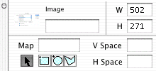
In Dreamweaver, you can create an image map by clicking on the image, then naming the imagemap in the lower left corner of the property inspector. Once the map is named, you can create multiple links by drawing a shape, and then associating the URL with the link, using the tools in the property inspector.
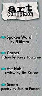
The following image has four links, one over each text area.
Making an image map:
- Click on the image
- Set the name of the map in the lower left of the property inspector (lowercase, no spaces, no special characters!)
- Select a shape (rectangle, circle, or polygon) from the lower left. When using the polygon tool, just click, do not drag.
- Draw a shape with the drawing tool. Use the arrow to edit the shape.
- Dreamweaver will create a translucent shape for your hotspot
- Enter a URL or local web page file name in the Link section
- If you want a link to open in a new browser window, set the "Target" selection to "_blank"
- Set the "ALT" section to the desired alternate text
- Create additional hotspots by repeating steps 3-8
- When you've finished, click on the arrow in the lower left of the property inspector to turn off the map drawing
Note: You may find that when the user clicks on an image map in Microsoft Explorer, an outline appears showing the shape of the image map. To remove this outline, you will need to edit the HTML and add a small amount of JavaScript.
- Find the <map> tag associated with the image you want to fix.
- Within the <map> tag, find the associated <area> for this hotspot.
- Inside this <area> tag, add the code onFocus="this.blur()"
For example:

<img src="table_files/lit_side.jpeg" width="140"  height="320" border="0"
usemap="#mymap" align="left" hspace="10">
<map name="mymap">
  <area shape="rect" coords="2,115,138,152"
      href="http://www.brickmag.com/" onFocus="this.blur();">
  <area shape="rect" coords="0,166,143,204"
      href="http://www.thinkoutside.com/" onFocus="this.blur();">
  <area shape="rect" coords="1,219,138,253"
     href="http://www.jacketmagazine.com" onFocus="this.blur();">
  <area shape="rect" coords="1,273,144,307"
     href="http://www.smc.edu/" onFocus="this.blur();">
</map>